Project
Brand Evolution
Overview
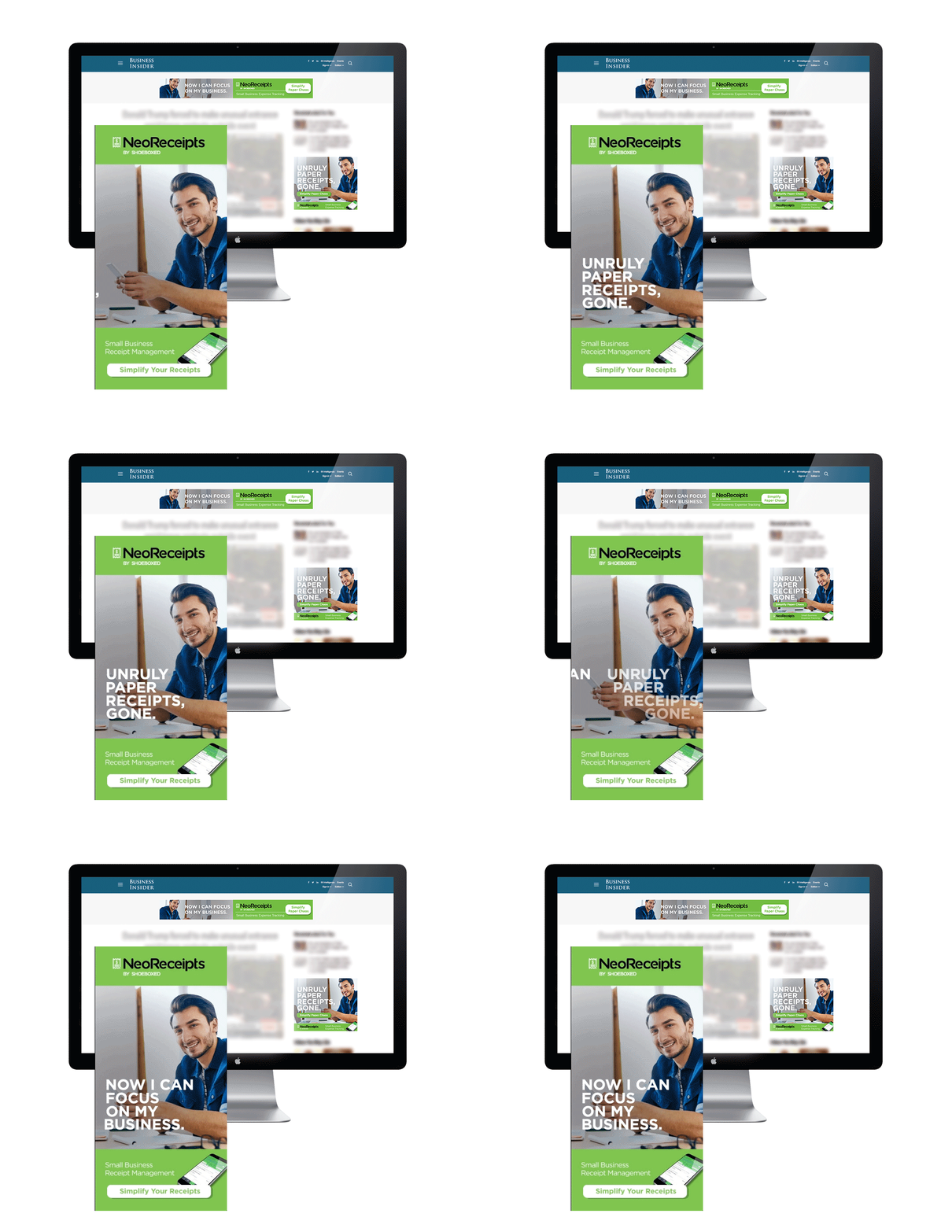
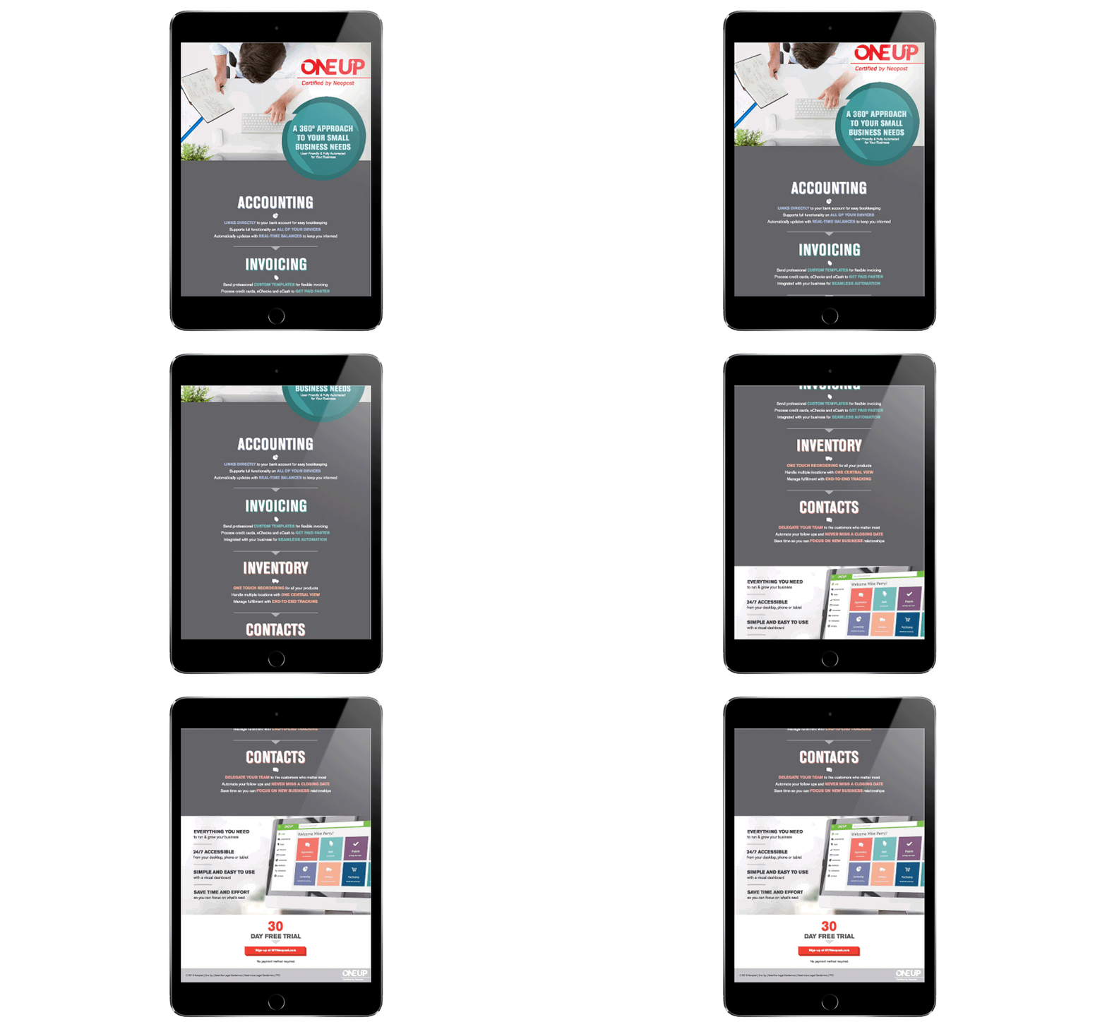
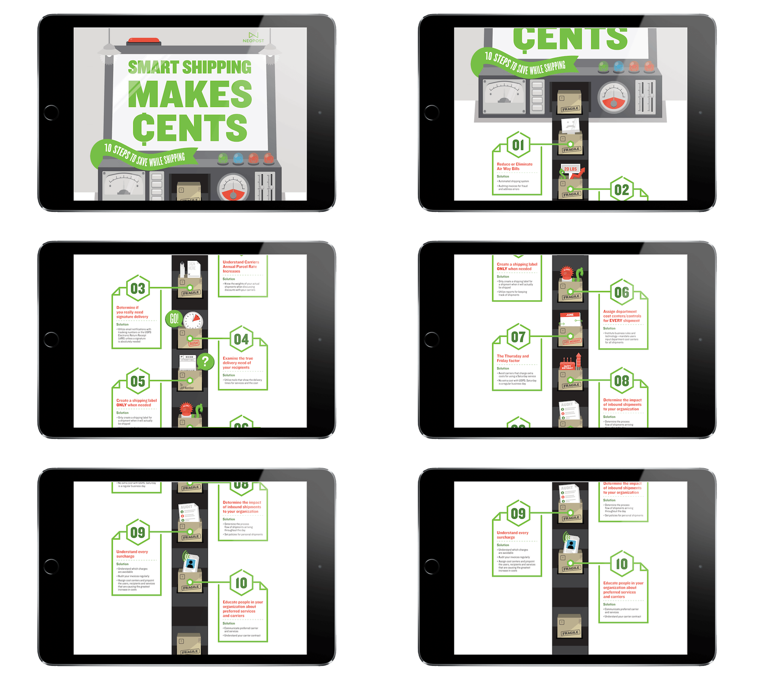
Neopost’s wealth of products and sub-brands offer an opportunity to create an expansive and consistent brand family. That may not sound exciting to most, but trust me, our designers jumped at the idea. Together with Neopost, we're building a visual story out of infographics, sell sheets, and emails that illustrates the simplicity that makes Neopost and it’s brands so desirable for users.
Scope
Case Study
When it comes to technical products like folding machines, postage meters, and commercial shipping software, it’s important to keep your brand messages and visuals clear and uncomplicated. We worked with Neopost to define and implement a visual language through infographics, banner ads, buyer’s guides and more. Through the use of branded Neopost icons, we’re able to delineate product categories and features at a glance. Colors and naming schemes also help to further simplify Neopost’s broad catalogue of products and services.
From a branding standpoint, the Neopost iconography helps to convey brand characteristics like tech-savviness, intuitive design, and efficiency. Consistency across web and print mediums further supports these brand characteristics and helps Neopost’s users quickly find the information they need. Overall, SilverCreative has helped refine Neopost’s core benefits and extend them to a strong and deliberate brand that empowers and informs both potential and current users.
