Project
Reinvigorating Rabina Properties
Overview
Rebranding a prestigious company can be intimidating to some. It's crucial to find a balance of old and new, mixing established and proven elements with new aesthetic without changing the brands core values. It's an intricate skill that Silver has developed and honed throughout the years. So when Rabina Properties set out to rebrand a long established family-owned real estate investment firm, we knew we'd be up to the task.
Scope
Case Study
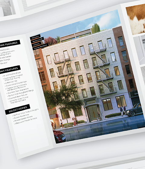
This project began with logo exploration. Before a pencil hits paper, it's important to focus in on a target. Using elements of the existing brand, Silver defined core brand values to be conveyed through the new logo and style. Through multiple rounds of client review and presentations, Silver crafted a unique logo that pays tribute to Rabina's real estate background, investment tactics, and vision for the future. From there, it was time to further develop the brand and extend to web and print identity.
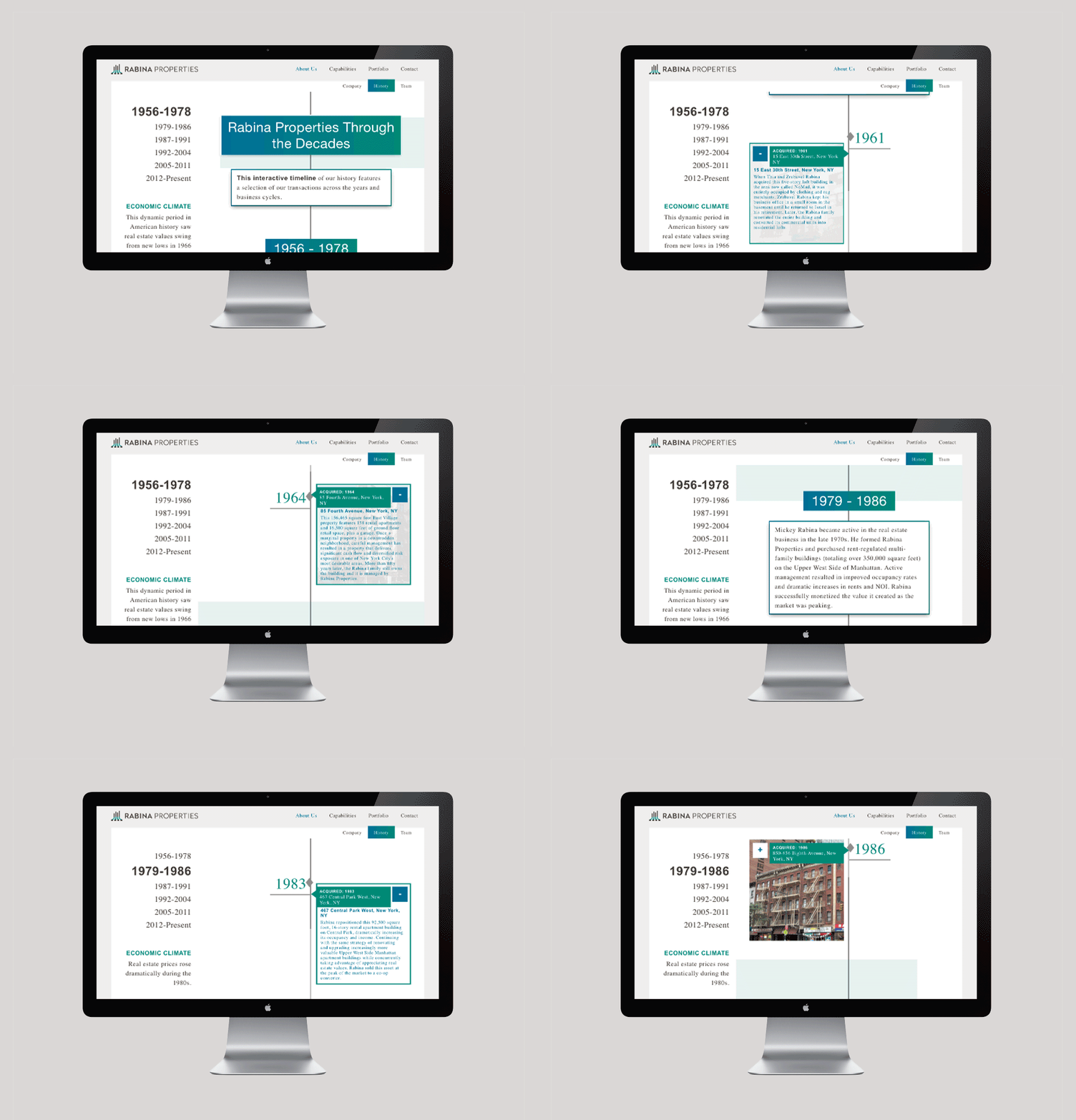
With a solid brand aesthetic established, web design was very efficient, which left valuable time within the budget to perform custom programming for unique content and functionality. RabinaProperties.com features an intriguing and informative timeline, custom built to convey the company's history and prominence throughout the years. Tasteful animation and tweaks throughout the site make the content pop and keeps viewers engaged, an important goal for all web ventures. With the website complete, stationery was the next venture to tackle. In order to satisfy the all needs within the company, Silver explored both digital and traditional print stationery so Rabina employees could have a range of options for on-demand printing as well as premium options for special occasions.


